Callout
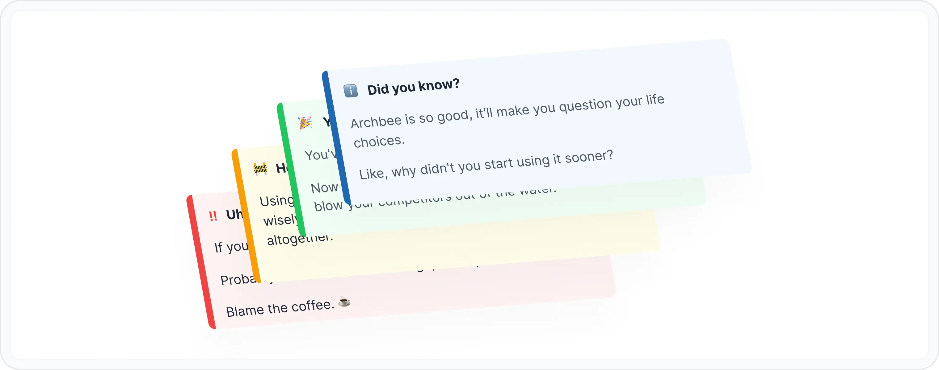
Think of a callout as a tiny, attention-seeking spotlight for your most important or interesting content. It's like a digital sticky note that screams, "Hey, look at me!" It's a versatile block that can be used to highlight tips, warnings, best practices, or just about anything you want to emphasize.
Why to use callouts?
- Highlight Key Information Is there something super important your users need to know? A callout is your megaphone.
- Provide Helpful Tips Want to be the documentation hero? Drop some helpful tips in callouts.
- Warn About Potential Issues Prevent user tears by using callouts for warnings.
- Add a Touch of Personality Callouts can be your secret weapon for injecting some personality into your docs. With custom colors, they can even wear your brand.
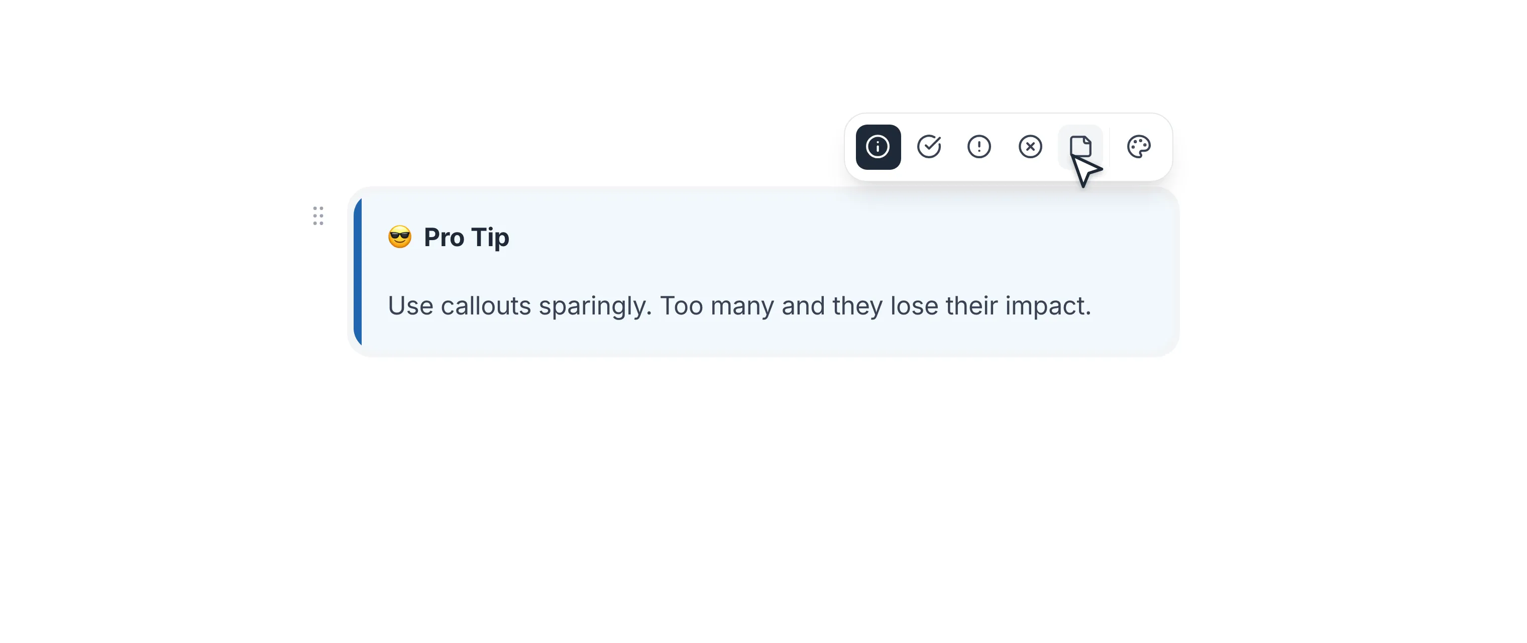
😎 Pro Tip
Use callouts sparingly. Too many and they lose their impact. It's like shouting at someone - it works for a while, but then it just gets annoying.
How to use the callout block?
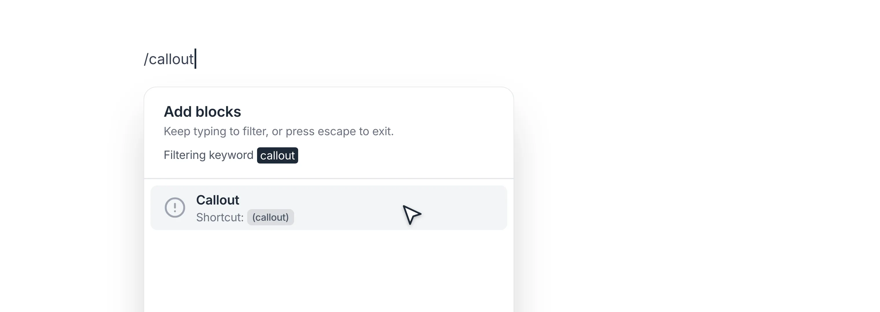
Type / to open Archbee block menu
Search for Callout block and click to insert it
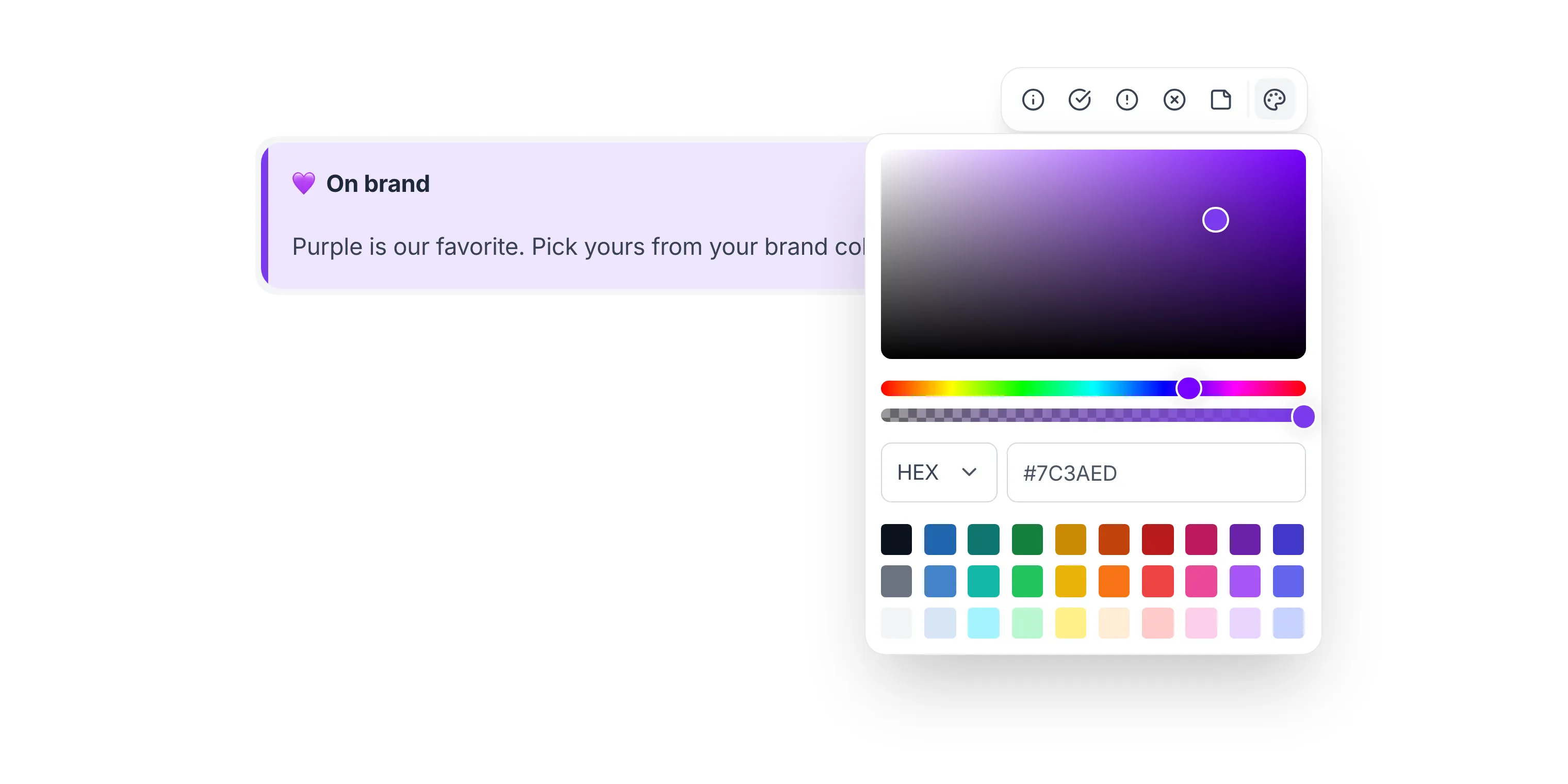
Hover over the callout to reveal its menu in the top-right corner, then choose the callout style
- ℹ️ Info — For general information, tips, or quick facts.
- ✅ Success — To celebrate accomplishments, highlight positive outcomes, or simply spread good vibes.
- ⚠️ Warning — To alert users to potential issues, cautionary notes, or important considerations.
- 🛑 Danger — For critical alerts, urgent messages, or situations that require immediate attention.
- 📄 Note — A neutral, gray callout for content that should stand out from body text without implying a tone, like examples, side notes, or context.
- 🎨 Custom color — Pick one of your brand colors or enter any hex code. Archbee generates the matching background tint automatically, so the accent bar and fill always stay in harmony.
Hover over each option to see a tooltip with its name.
Feel free to add your content. You can style the content however you like using the WYSIWYG MenuWYSIWYG Menu or even insert other blocks, like:
- HeadingsHeadings
- Expandable HeadingsExpandable Headings
- ListsLists
- ButtonButton
- Horizontal DividerHorizontal Divider
- FileFile
- ImageImage
- VideoVideo
What you see is what you publish
The callout menu lives outside the callout's text area. It only appears when you hover over the block, floating in the top-right corner, and it stays visible while you move your cursor toward it.
That means a callout in edit mode looks exactly like it does in read mode. No toolbar inside the box, no extra spacing, no surprises when you hit publish.
The block menu (drag handle, duplicate, delete and friends) appears on the left side when you hover over the callout block.
Markdown
Want to add callouts to your documentation directly through Markdown? We've got you covered!
Archbee supports a specific Markdown syntax with triple colons (:::). Type :::hint followed by a type attribute to define the callout type: info, success, warning, danger or note. The older style attribute still works too.
:::hint{type="info"}
Use info callouts for general information, tips, or quick facts.
:::

:::hint{type="success"}
Use success callouts to celebrate accomplishments.
:::

:::hint{type="warning"}
Use warning callouts for cautionary notes.
:::

:::hint{type="danger"}
Use danger callouts for critical alerts.
:::

:::hint{type="note"}
Use note callouts for neutral content, like examples or side notes.
:::
To use a custom color, set type="custom" and pass any hex code in customColor:
:::hint{type="custom" customColor="#7C3AED"}
This callout uses a custom brand color.
:::
Alternatively, use this flavor of Markdown to generate a callout block:
:::hint{style="note"}
some hint
:::
Check the Use Markdown shortcutsUse Markdown shortcuts page to see more markdown shortcuts for other blocks.
Examples
Here are some examples to show you the callout block:
- ℹ️ Info
ℹ️ Did you know?
Archbee is so good, it'll make you question your life choices.
Like, why didn't you start using it sooner?
- ✅ Success
🎉 You did it!
You've mastered the art of callouts.
Now go forth and create amazing documentation that will blow your competitors out of the water.
- ⚠️ Warning
🚧 Heads up!
Using too many callouts can be distracting. Use them wisely, or your readers might start to ignore them altogether.
- 🛑 Danger
🚨 Uh-oh!
If you're seeing this, something has gone terribly wrong. 🫣
Probably not with Archbee though, we're perfect. 💅✨
Blame the coffee. ☕️
- 📄 Note
📝 For the record
Not everything is a tip, a win, or a crisis. Some things just deserve a quiet little box of their own.
- 🎨 Custom color
💜 On brand
Purple is our favorite. Pick yours from your brand colors, or paste any hex code.
🌊 Calm and collected
The background tint is generated from your color automatically. You pick one color, Archbee handles the rest.
🔥 Hot off the press
Perfect for release highlights, launch banners, or anything that should feel a little louder than info.

Find other blocks
Discover new ways and blocks to create stunning and functional documentation pages.
Editor BlocksCheck out all blocks

Need help? ⬇️
Use the blue chat bubble from bottom right corner.
Or try AI Chat (from search box) for quick answers.

Your opinion matters
Use the below feedback form, anonymously.
Or ask a question in Q&A section and our team or AI will give you a solution.